Bad visualizations
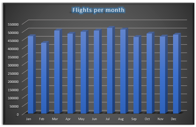
Flights per month
Too much categories for a pie chart, difficult to compare visually.
Too much noise, unneeded 3D, colors, effects.
Flights count per airline
Inappropriate chart type, the data has nothing to do with trend/time. Something like bar chart would be much better.
Misleading charts
Top 5 airlines by flights count
Starting bar chart Y axis not from 0 (truncated graph). Gives impression that the first airline is twice bigger than the second one etc., while the real difference is much smaller.
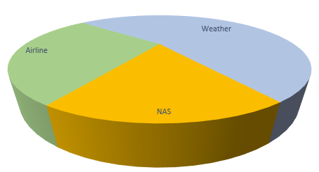
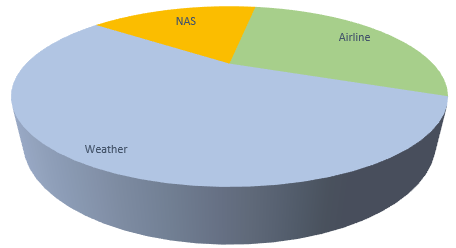
Cancellation reason
3D pie chart gives impression that item in the foreground is much bigger.